Sunday, November 30, 2008

two page spread - getting started


i had another version of a background picture but i cant get it to upload for some reason. oh well, i wasn't really planning on using it anyways.

as far as the type goes, well, as most of you should know now i havent worked that all out yet, i focus on imagery first and foremost, then i work the type into my composition. then i worry about the type choice. in a way i was slightly worried about being a bit redundant with the imagery (in regards to the cover and mast head spread) but i feel it is good to stay cohesive being that this background choice conceptually reflects the cover story.

in the window above his head i was going to probably photoshop some broken glass up in it. and have a faded image of either the band logo, or a picture of the band performing. as if its stating those days have been thrown out the window (the band broke up). im not sure if im going to do that or not though. does anyone feel the windows in this particular shot draw too much attention??? feedback please.....


by the way here is the design for the mast head / table of contents:
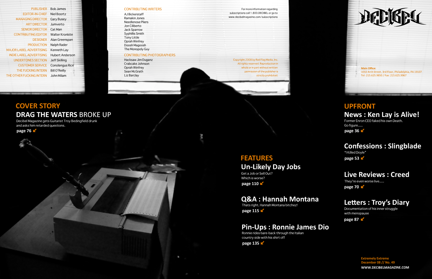
Decibel Magazine - two page spread

Monday, November 10, 2008

wine sketches and magazine cover


im leaning toward the one on the far right. what do you guys think? keep in mind i still havent created my own type yet. i sketched some out, but forgot to bring my camera with me to get it into my computer.....
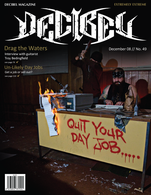
Decibel Magazine Cover
my brief: decibel magazine is basically a raunchy dirty im gonna fuck your face death metal magazine. but the design work of it seemed way too commercial to me. troy, who is in my class, happens to have used to be in a death metal band with an old friend of mine from high school. the band recently broke up. so i decided to do a skit of him working a shitty day job dozing off thinking about what he'd really like to be doing. troy also happens to be of viking decent.........

Tuesday, October 28, 2008

wine bottle inspiration:

so im totally wanting to do INNOCENT BYSTANDER for my wine bottle design. i am having some trouble finding the bottle to get a good look at the info on the back of the bottle. it seems pics of the back label are non-existant on the web. but if it comes down to it i'll order it off some website. anyways, i want to try to base my design off of my good buddy kyle and his magical adventures in st. paul:

and

and on the wine note:

Wednesday, October 22, 2008

another crap artshow.....

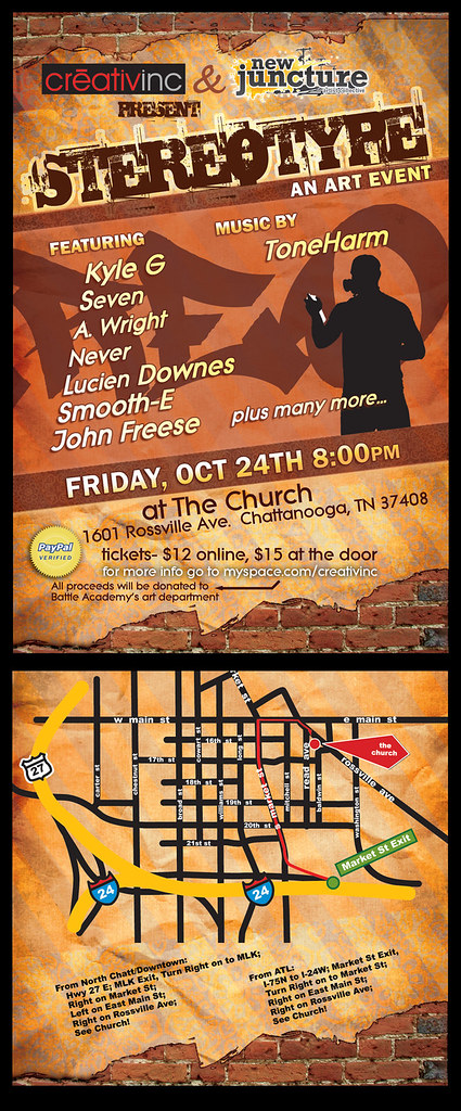
"stereotype"
art show i got a call about the other week. its going on up in chattanooga. im thinking about trying to set up camp saturday. anybody up for a camping trip???

btw i did not design this flyer in case any of you were thinking i did........

Monday, October 20, 2008

wine bottle examples.....


MFA POSTER - not quite done yet


anything else? is the MFA legible to you guys? i tried playing with it a bit and doing different colors, for some reason when i opened up the file on the computers at school it threw out all the layers i had created so any editing is a pain in the ass because of the excessive amounts of layers and clipping masks which are now all placed onto ONE layer. anyone got any other comments / criticisms? maybe i should put a tornado up in the sky? haha

Friday, October 17, 2008

sarah palin on religion.....

ignore the cheesy background music.....

now obviously this video has been edited alot and is a bit exagerated. but just to explain further for those of you unfamiliar with the beliefs and behavior of "pentacostal" church-goers just watch this next video clip of a church service:

now watch this dubbed version.........

much better. hahahahahahahahaha!!!