Monday, April 28, 2008


of course while i was in charlotte for the day that i was there i couldn't resist going out and painting something for fun. i met up with a couple of others guys i know in town that paint and we found a lovely abandoned school just up teh street from the venue where the even was held. inside all the walls were torn apart because apparently some homeless guy wanted to take all the copper pipes from inside the walls to take them to a recycling center for some money. so we decided to paint outside of the place on the rough brick surface. i found a nice 5 gallon bucket of white paint inside so i decided to put it to use and splattered it on the wall a couple of places after i was finished with my piece. 

pics from my charlotte trip over the weekend...


here are a couple of pictures from the show we had in charlotte over the weekend. the first few are of us preparing our work for the show, there were over 20 artists involved in the show so i didn't feel like posting a crapload of pictures. the bottom one is obviously of the turnout of the event. it was prtty freaking crowded, and i decided i wasn't in the mood to stand around in all that crowd so most of us just ended up hanging out on the back dock of the venue most of the night talking. 

as for my installation for the show, since i had such a lack of time to prepare i had to recycle some older photographs frm a previous show. i ended up having to reprint/remount/rebuild them all thought because whoever hung them up at the sundial messed them up so i did it all over again.
there is the final layout for the brochure. just thought i'd share

Monday, April 14, 2008


here is the finished product for my DVD case. i am unsure of how i want to present it on a board though. one is just an illustration of the layout. and the other are pictures i took of the actual box i built over the weekend. i must say that craft has consistently been one of my weaknesses; but i definately worked on that through-out the weekend. i re-made this 4.5 times before i was semi happy with it..........

anyways, which seems like the more logical way to present this on a board??? the illustrator layout, or the photo layout? im kind of leaning toward the illustrator layout. but i definately wanted to get some practice with doing photo layouts like i did.

Wednesday, April 9, 2008

specialty item: dvd package for reel

still have ALOT of cleaning up and editing to do. but this is the direction i am going in. i left my thumbdrive in my other bag so i had to do this all from scratch (logo / photos). anyways, i want to have the lightrig image placed in the middle of the flap and bleeding into both pages. the front flap will remain blank with the top corner cut off kind of like the way i did with my business cards. the corner will be revealing the green texture of the lightrig once i get this thing made.

feedback please???

Sunday, April 6, 2008

other anonymous work.....


here are a couple of pictures from my most recent art project that i just knocked thursday. the other canvas ones are from an art show my friend got me in on at the end of february at the sun dial restaurant on top of the westin hotel. i was kinda worried the ternader might've messed them up but i got a call yesterday from some guy wanting to buy something saying he was just in there 5 days ago and everything was fine.

Saturday, April 5, 2008

my poster assignment from last semester


i am trying to go back and make final adjustments to all my work from last semester for my portfolio. the version without the blue lines is the version that was turned in. but i kind of like the way it looks with the half frame out to the side. what do you think? feedback please..........

Tuesday, April 1, 2008

did some more work


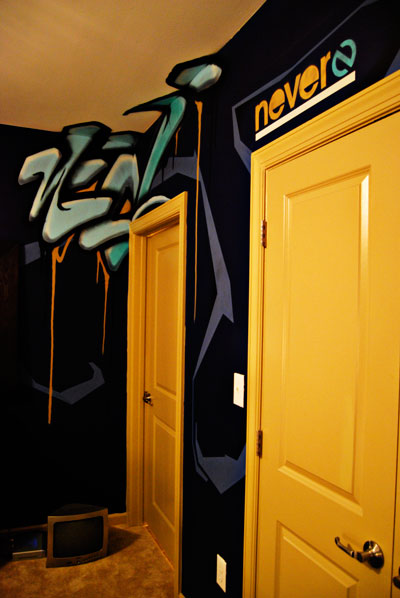
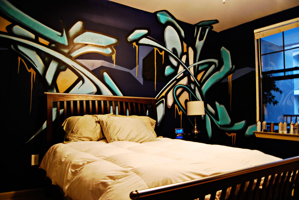
im definately trying to keep a consitancy here. and being that in my logo, as well as all of the stationary i did, i stuck to using black/green/white i suppose i should stay that way here. as much as i want to show off the cool texture of the bricks inside the place as opposed to the smooth greenscreen surface; i just dont feel like that message is going to really communicate to someone looking for the type of service my company offers. im not real sure how to explain it, but its funny to me how simplistic design gives off such a technology feel to me. prime example of what i am talking about would be pretty much all of the Apple designs out there. and i could name off several other companies as well but i think that is one we can all relate to. anyways, i suppose its going off this logic that technology is super complex but is created to make our lives more simple type of thing. i guess thats what i get out of it all. anyways, any final comments before i print these things out????????

the first two remain consistent, the last one was a mistake that i felt worked to my advantage. i kind of like the white sillouette look i created from outlining all of the negative space around the object with the pen tool. but if i make it black than its too heavy. and if i make all the others white, well, it just wasn't working out for me. dammit i need to quit being so indecisive........
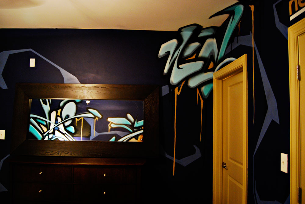
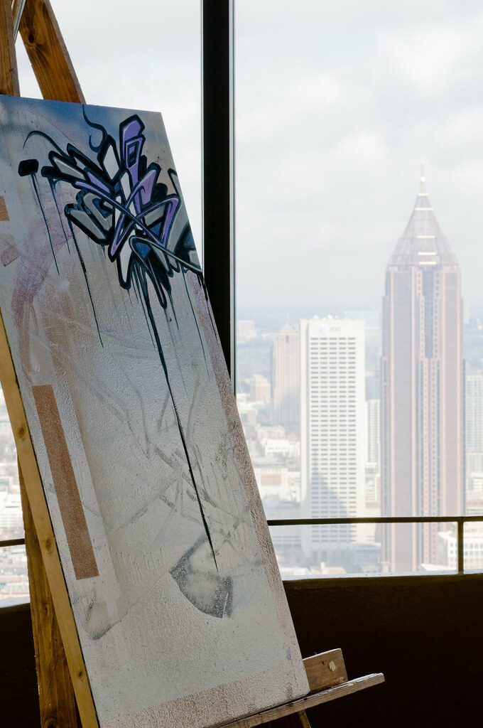
not sure where to go


okay, my questions are: 1.) does the brick texture annoy you because of it only being on the left side of the ad and nowhere else? i am trying to play with a combination of the two textures inside the facility. it is interesting how rough the original walls are inside the place compared to the greenscreen section of the studio. but does it make sense to use this in the ad? question 2.) should i use the faded out technique on the left edge of the greenscreen or should i stick to a straight line seperating it from the background? when the fade is there it makes the greenscreen look more like its own object. with the line it does a nice job seperating the textures and all, but it just seems like too crisp of a line. anyone got a preference? as for the last one, i dont know what the hell i was doing with that, just playing with the placement of everything. not sure why i posted it