Monday, April 27, 2009

enron shirt


i believe im gonna go with the simple white one on the top, i feel the subject matter of the image has enough "shock value" to inquire someone to ask what its about. i prefer to let the image speak for itself and then the name small and suttle on the back.

Tuesday, April 21, 2009

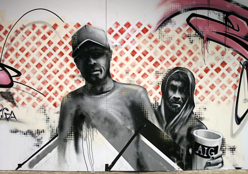
state of the economy

state of the economy
can you spare some change?

http://photos-h.ak.fbcdn.net/hphotos-ak-snc1/hs019.snc1/3033_620724281627_22605433_35953679_5966660_n.jpg

there is a lecture (if any of you have the time) going on this weekend at a friend of mines coffee shop located right over by justin and james' house just incase anyone might be interested...

-nev

Monday, April 20, 2009

some of my book layouts...


i am still tweaking them a little.

im not sure they are urban enough.....

Thursday, April 9, 2009

iron man poster


the idea/concept is to portray it as a dirty blueprint held up to the light. in the movie he built the armor in a dirty cave and there was one part where he holds the blueprint on the light table and secretly shows it to the other guy. therefore the idea is to make it look like a grungy blueprint held over a light. but i am unsure about two things.

1) if you look closely at the way i did the glow in the eye, you can see a line at the bottom, i did that to make it look like a beam of light casting over the bottom part of the eye. is that a good way to go about it? or should i just made it go all the way to the black

2) the little white lines. with or without?