
im leaning toward the one on the far right. what do you guys think? keep in mind i still havent created my own type yet. i sketched some out, but forgot to bring my camera with me to get it into my computer.....
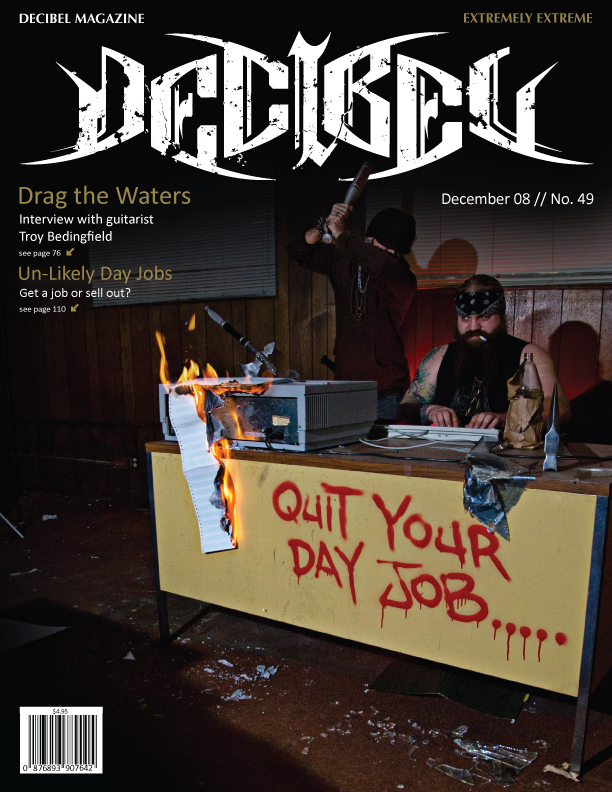
my brief: decibel magazine is basically a raunchy dirty im gonna fuck your face death metal magazine. but the design work of it seemed way too commercial to me. troy, who is in my class, happens to have used to be in a death metal band with an old friend of mine from high school. the band recently broke up. so i decided to do a skit of him working a shitty day job dozing off thinking about what he'd really like to be doing. troy also happens to be of viking decent.........
7 comments:
I like the middle one better. On the right one, I just think the choice of typeface is not the best one.
The second one from left is also nice.
right now im trying to figure out which imagery to go with, i am stuck between the 3rd one and the one on the far right. between the profile shot and the guy cuffed up. which image is stronger?
ignore the type for now........
I like the cuffed one, because the other one ,a little bit, look like Liberty Statue for me. Maybe it's just me.
haha, ya, i see what you're saying. im still a bit torn between the two though. i may try to combine them somehow....
I prefer the third one from the left. Overall, I think the handcuffed image goes better with the name, but both illustrations are nice. Defintely don't use that italic font though!
Like the composition in Third one from the left, but I like the head shot in the last one except the height rulers. (oh..wow, I just saw you visioned the same thing.)
Post a Comment