Monday, December 1, 2008

nev's whimsical adventures.....


a few pics from st louis

fun times. unfortunately i was too drunk to hold the camera still long enough to snap a shot at the show. but im sure they probably put pics up on the site by now: www.artbeatsandlyrics.com


in the pics above there are a couple of shots from the show. one is of my homey dancing, another is of my homey ALIen, he is seriously amazing on the drums. check him out here:
www.youtube.com/watch?v=LYtTnCfNVE8
then the other shots were during our ride home. we stopped at a rest stop somewhere in bumfuck kentucky on the way back and we have never seen so many freaking birds in our lives, we were pretty drawn to go take pictures while all the local rednecks were lookin at us like we were stupid.....
st louis "arch"
so some local heads i met up there were laughing at me because they said people from out of town always pronounce it "the ark" (ark being a large boat). rather than "the arch". haha, unfortunately i was one of those dumb tourists.....
SWIMMING ABOVE WATER
"swimming above water" - this was a BITCH to paint, long story.....
st louis - blowfish

Sunday, November 30, 2008

two page spread - getting started


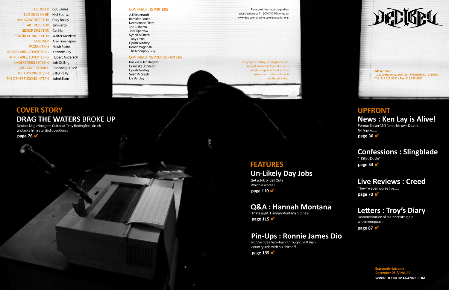
i had another version of a background picture but i cant get it to upload for some reason. oh well, i wasn't really planning on using it anyways.

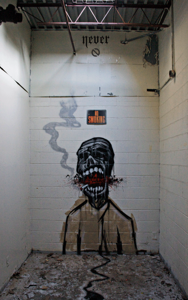
as far as the type goes, well, as most of you should know now i havent worked that all out yet, i focus on imagery first and foremost, then i work the type into my composition. then i worry about the type choice. in a way i was slightly worried about being a bit redundant with the imagery (in regards to the cover and mast head spread) but i feel it is good to stay cohesive being that this background choice conceptually reflects the cover story.

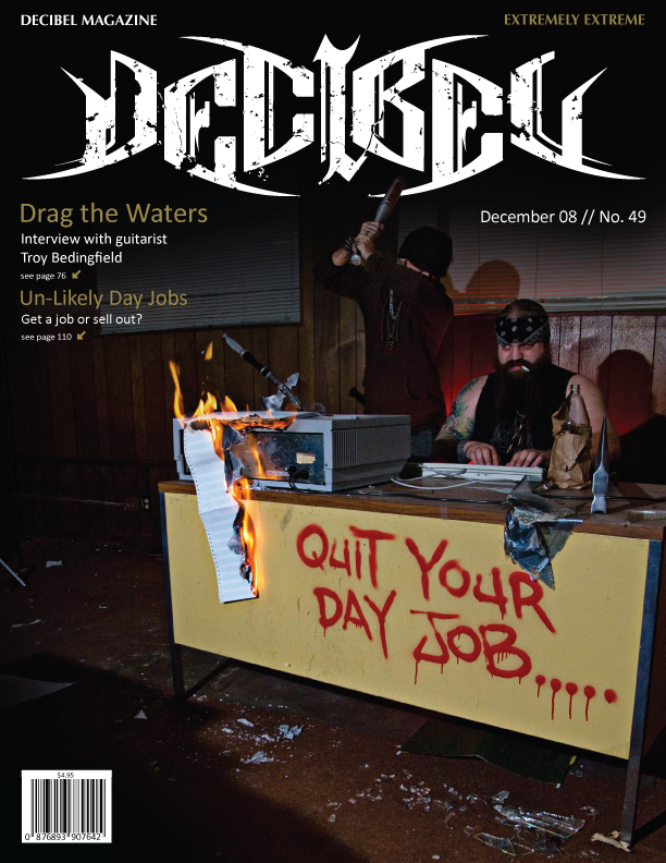
in the window above his head i was going to probably photoshop some broken glass up in it. and have a faded image of either the band logo, or a picture of the band performing. as if its stating those days have been thrown out the window (the band broke up). im not sure if im going to do that or not though. does anyone feel the windows in this particular shot draw too much attention??? feedback please.....


by the way here is the design for the mast head / table of contents:
Decibel Magazine - two page spread

Monday, November 10, 2008

wine sketches and magazine cover


im leaning toward the one on the far right. what do you guys think? keep in mind i still havent created my own type yet. i sketched some out, but forgot to bring my camera with me to get it into my computer.....
Decibel Magazine Cover
my brief: decibel magazine is basically a raunchy dirty im gonna fuck your face death metal magazine. but the design work of it seemed way too commercial to me. troy, who is in my class, happens to have used to be in a death metal band with an old friend of mine from high school. the band recently broke up. so i decided to do a skit of him working a shitty day job dozing off thinking about what he'd really like to be doing. troy also happens to be of viking decent.........

Tuesday, October 28, 2008

wine bottle inspiration:

so im totally wanting to do INNOCENT BYSTANDER for my wine bottle design. i am having some trouble finding the bottle to get a good look at the info on the back of the bottle. it seems pics of the back label are non-existant on the web. but if it comes down to it i'll order it off some website. anyways, i want to try to base my design off of my good buddy kyle and his magical adventures in st. paul:

and

and on the wine note:

Wednesday, October 22, 2008

another crap artshow.....

"stereotype"
art show i got a call about the other week. its going on up in chattanooga. im thinking about trying to set up camp saturday. anybody up for a camping trip???

btw i did not design this flyer in case any of you were thinking i did........

Monday, October 20, 2008

wine bottle examples.....


MFA POSTER - not quite done yet


anything else? is the MFA legible to you guys? i tried playing with it a bit and doing different colors, for some reason when i opened up the file on the computers at school it threw out all the layers i had created so any editing is a pain in the ass because of the excessive amounts of layers and clipping masks which are now all placed onto ONE layer. anyone got any other comments / criticisms? maybe i should put a tornado up in the sky? haha

Friday, October 17, 2008

sarah palin on religion.....

ignore the cheesy background music.....

now obviously this video has been edited alot and is a bit exagerated. but just to explain further for those of you unfamiliar with the beliefs and behavior of "pentacostal" church-goers just watch this next video clip of a church service:

now watch this dubbed version.........

much better. hahahahahahahahaha!!!

Thursday, October 16, 2008

zeitgeist - addendum

http://video.google.com/videoplay?docid=7065205277695921912

this is a good documentary about economic slavery, and its free to watch, i thought i'd share. i highly recommend watching this movie if you have the time to sit down and watch it.

Tuesday, October 14, 2008

how about this??????

can i get some feedback?


so i've been experimenting with texture shots i had taken, and playing around with live trace settings and kinda like this look. but im unsure of which version to go with. what do you guys think: red or blue? gray texture or just white? does the gray texture drown out the text too much? or is it still legible? maybe once i print it out i'll be able to tell for sure. keep in mind i still havent focused on information hierarchy and all that stuff. right now im mainly concerned with the over-all layout of the background.

Sunday, October 5, 2008

for all you smokers in class


i really needed to paint something to keep my sanity levels normal so i took an hour and a half out of my day sunday and layed up a quick character using the sketch i did for my illustration i am currently working on in Paige's class. i originally intended to just paint a zombie for halloween, but then i saw the "no smoking" sign in that particular room and decided to improvise my concept a bit.........


also, friday night i got an invite to this artshow. basically the whole show was to promote these lofts opening up off memorial drive in reynoldstown. i felt quite out of place because of alot of the boujiness of the people around me at this particular show, but when presented with free drinks i can get around that. i thought this show was interesting because they basically used the entire 4 story building, including the pool deck, and the rooftop to throw this artshow. all of the individual lofts that were currently empty were turned into individual galleries for individual artists to display their work. i have never seen art used to promote luxury lofts in this particular way, thought it was kind of an interesting idea. figured i'd share.....

blog assignment 5: design trends


layered collage of vector imagery has been a pretty popular and often successful means of design i've noticed recently.....
this is another example of layering vector images. this is some work by a friend of mine who goes by the alias "urban medium"

another piece by my friend "urban medium". i've felt recently its been quite popular to use the "color halftone" function in photoshop.

the last black and white design (i dont get how it works when i upload photos as far as order goes). this particular design is by my friend Dosa Kim. he does alot of work with a kind of sloppy sharpie marker feel to it. as well as alog of the layering of vector imagery. he is a relatively well-known designer here in town and his work to me definately reflects current trends in graphic design.....

Saturday, October 4, 2008

blog assignment : inspirational work

BANKSY : definatley my favorite artist in regards to concept, subject matter, and placement. this guy has a message, and i HIGHLY recomend his work to anyone who asks.....


DAIM : a german graffiti artists / designer who has an untouchable 3 dimensional style to his work, and his use of color is quite impressive as well
BOND : another European graffiti artist whose work i particularly am impressed with. this guy uses texture well in his work