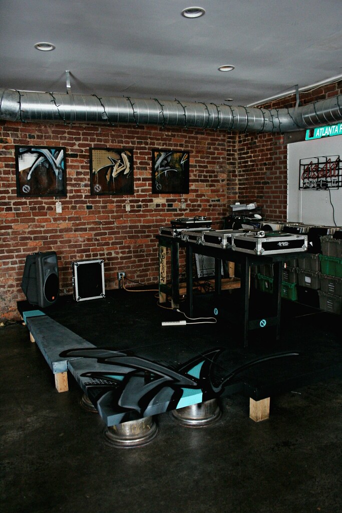
Monday, November 30, 2009
Saturday, November 28, 2009
illustration class ish

working on a fake "Where The Wild Things Are" book cover. its not done, but i dont really have the time to do much more than where its at. i think it looks okay with the white space for the most part, just need to do the title and leave it at that. does anyone have any ideas that i could pull off to bring this together that wouldn't be as time-consuming as it was to draw those characters?
this is how i see myself

or

i could have exagerated the down-syndrome facial features a little bit more but whatever. MOVING ON!.....
Saturday, October 24, 2009
illustration class - concert poster

this is a poster i did for illustration class. for those of you that dont know who Prefuse is, he is in my opinion one of the best musical talents i can think of that got their start in Atlanta. dude is a very unique and diversely talented musician and i highly recommend seeing him live.
Thursday, October 22, 2009

Monday, October 19, 2009
campMODA

so, after digging around in my parents basement for all my old lego toys and playing with it i found out Lego is no longer a sponsor. oh well, this is just a beginning; OBVIOUSLY alot of this is just place holder graphics. i'll try to do some illustration with crayons and other things. anyways, here:
Wednesday, October 14, 2009
The Jane Hotel (in progress)

here is the current state of the logo as well as the current state of the stationary. i am completely open to criticism on this to fire away...
LOVENESTS finished...


and WOW, i just realized my designs got completely screwed up when i uploaded them on to here...
Monday, September 28, 2009
lovenest stuff - moving along


here are a couple of versions of where i am headed with the posters/cards. they aren't exactly the most conceptually brilliant pieces i've ever made and YES I KNOW THE ALL TYPE ONE SUCKS RIGHT NOW. its very much in the making. it will be several different typefaces i am thinking all justified. for the posters to the right with the nests. which do you prefer? one of them the nest is more high contrast, and one is less. also, do you think the nest looks better in the center and feel the nest at the bottom is too bottom heavy? or do you like the nest at the bottom? let me know what you think...
Saturday, September 26, 2009
i liked justins illustrations better...

"This is a picture of Marilyn Monroe made entirely out of different fonts for an ad in a São Paulo newspaper. Check out three more of Charlie Chaplan, Marlon Brando, and James Dean after the jump, all of which look great."
i randomly stumbled accross this on some blog. thought it was funny, justins type calendar was better...
Monday, September 14, 2009
lovenest layouts/ideas...
these are only rough layouts of compositional ideas. the imagery is just placeholders which will either be better illustrated in the future, or photographs will be used. i dont want to do hearts! a bit too obvious in my opinion, but who knows. since it is about photographers, and objects i figured i'd do something playing with rolls of film placed inside a birds nest like eggs or something. or rolls of film with pictures of objects such as birdsnests in the negatives. on the first one, the black frame around it would be a border you would see when looking through the viewfinder of an old camera. here is an example of what im talking about: 
(thanks john) as for the type choice, the word "LOVE" is going to be the same font from the I heart NY logo, and then just a simple sans serif font like helcetica (which they seem to like using) for the rest. also, since industrial design plays a part in this show, one of them has a kind of blueprint type of sketch for a background texture...


or maybe i could do an illustration of a vintage camera with a big ass hightech freaking fort built around it...

i have alot more to do...
(thanks john) as for the type choice, the word "LOVE" is going to be the same font from the I heart NY logo, and then just a simple sans serif font like helcetica (which they seem to like using) for the rest. also, since industrial design plays a part in this show, one of them has a kind of blueprint type of sketch for a background texture...


or maybe i could do an illustration of a vintage camera with a big ass hightech freaking fort built around it...
i have alot more to do...
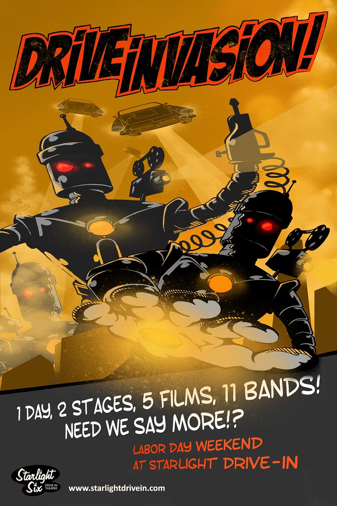
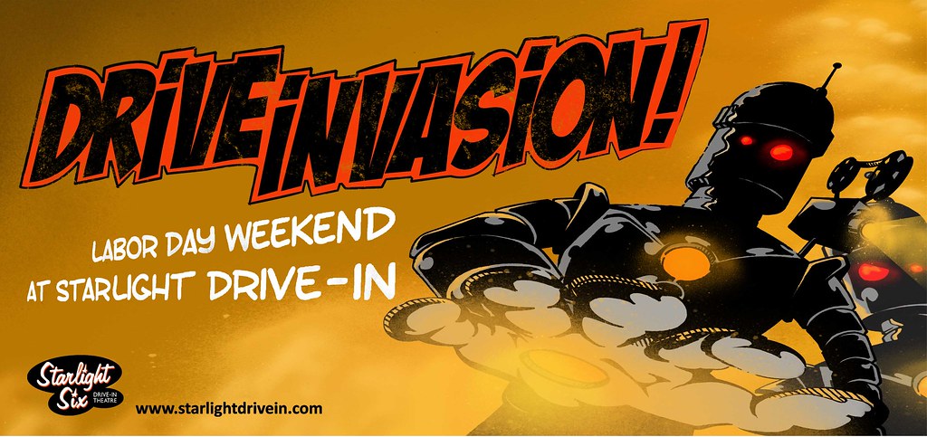
Wednesday, September 9, 2009
drive invasion poster (in progress)

still need to add some stuff, including people in the forward ground running away screaming and more saucing flyers that look like cars in the sky. then of course some comic style lettering for the title and all that jaz. anyways, yeah...
Sunday, August 23, 2009
this is clever as hell
so this was brought to my attention a couple of months ago. this dude from Portugal i believe decided to steal a bunch of video footage of people on youtube who recorded themselves playing instruments, MC'ing, singing, acting like idiots, etc. and edit the hell out of it to create some interesting music. this is one of those things where tons of other beat-makers would see this and be like "damn! why didn't i ever think of that!?" and whats really funny is to think of if the people who are in these videos ever were to see themselves in one of this guys videos. haha, i bet the dude MC'ing in the third video would probably shit himself. anyways, check it out. its worth the time. effing brilliant and pure creativity...
the guy created an entire LP. check out his youtube channel here: http://www.youtube.com/user/kutiman
he goes by "thru you"
effing brilliant!!!
the guy created an entire LP. check out his youtube channel here: http://www.youtube.com/user/kutiman
he goes by "thru you"
effing brilliant!!!
Wednesday, August 19, 2009
low budget stop motion animation
im sure some of you have already seen this. but i found it interesting because this guy is from Bologna, Italy and i was hanging out with a buddy of his in Bologna the other week and saw a bunch of Blu's stuff in person. i cant even imagine how long it took him to create this...
summer internship
didn't really get much done in relation to graphic design. most of the work done over the summer was film stuff with a little bit of playing around in post with after-affects keying people out from a greenscreen. but really, i have very little to show aside from a couple of pictures i snapped while working on a cheesy Verizon Wireless commercial shoot. god it was cheesy...


im probably not supposed to share these but honestly im not that worried about it...
then, they decided to exploit my painting skills a little bit for a halloween costume company. the video shoot for this was a bit mind-numbing in the sense of how retarded it was, it was also a bit innapropriate for class; so as soon as it is finished and online i will be sure to post it up! it featured a girl dressed up like a "pimp" surrounded by two other girls dressed up as giant tits; throwing money around. it was a very high concept video.

Sunday, July 12, 2009
the louisiana house taking a moment to recognize a very talented and aspiring young musician
so seriously 2009 has to have been the worst year yet for the rap industry. its like the record companies are all having a competition with each other to see how much they can raise the bar of stupidity. now this crap is infiltrating our forms of government!?
i dont know whether i should laugh right now or just be ashamed to be an american. for the most part, i laughed pretty hard when my friend showed me this.
i dont know whether i should laugh right now or just be ashamed to be an american. for the most part, i laughed pretty hard when my friend showed me this.
Sunday, July 5, 2009
unnecessary rap song of the year...
this horrendous "tribute" to Michael J by "The Game" was, unfortunately , brought to my senses. It also features an aweful MJ tattoo that "The Game" now sports. and what the hell is "gangster" about laying in a bathtub surrounded by scented candles. But, at least all the proceeds will go to the Jackson family trust. you know, the one worth over a BILLION DOLLARS. I can't think of anyone more deserving. jeeeeez.
Thursday, July 2, 2009


Friday, June 19, 2009

Monday, April 27, 2009
enron shirt

i believe im gonna go with the simple white one on the top, i feel the subject matter of the image has enough "shock value" to inquire someone to ask what its about. i prefer to let the image speak for itself and then the name small and suttle on the back.
Tuesday, April 21, 2009
state of the economy
can you spare some change?
http://photos-h.ak.fbcdn.net/hphotos-ak-snc1/hs019.snc1/3033_620724281627_22605433_35953679_5966660_n.jpg
there is a lecture (if any of you have the time) going on this weekend at a friend of mines coffee shop located right over by justin and james' house just incase anyone might be interested...
-nev
Monday, April 20, 2009


Thursday, April 9, 2009
iron man poster

the idea/concept is to portray it as a dirty blueprint held up to the light. in the movie he built the armor in a dirty cave and there was one part where he holds the blueprint on the light table and secretly shows it to the other guy. therefore the idea is to make it look like a grungy blueprint held over a light. but i am unsure about two things.
1) if you look closely at the way i did the glow in the eye, you can see a line at the bottom, i did that to make it look like a beam of light casting over the bottom part of the eye. is that a good way to go about it? or should i just made it go all the way to the black
2) the little white lines. with or without?
Sunday, March 15, 2009
Tuesday, March 10, 2009

Subscribe to:
Posts (Atom)