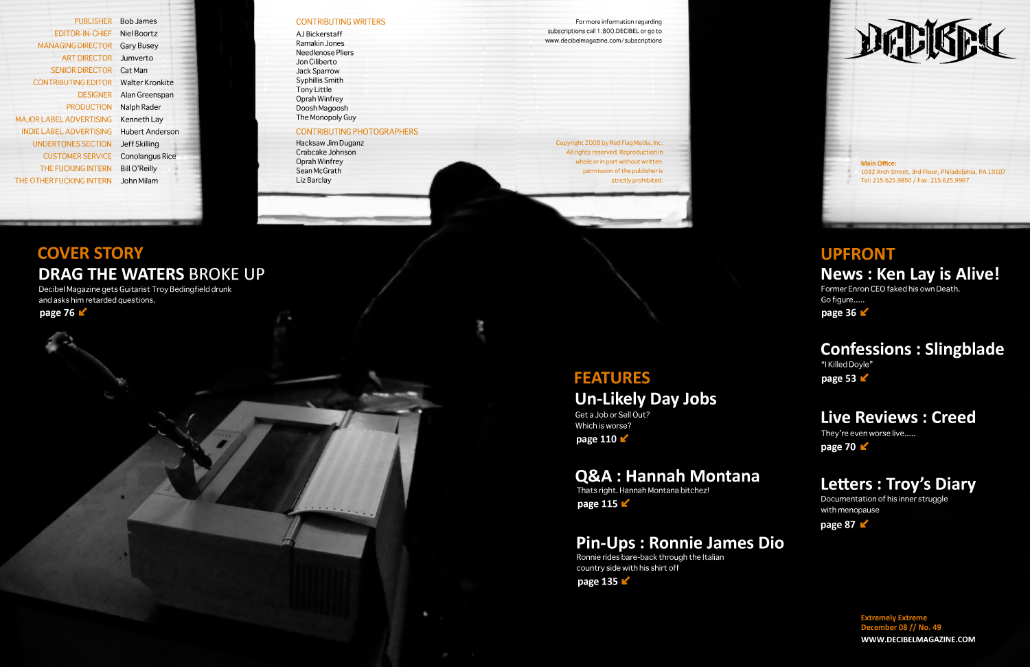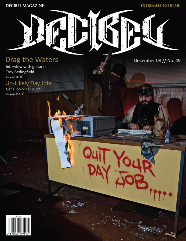
i had another version of a background picture but i cant get it to upload for some reason. oh well, i wasn't really planning on using it anyways.
as far as the type goes, well, as most of you should know now i havent worked that all out yet, i focus on imagery first and foremost, then i work the type into my composition. then i worry about the type choice. in a way i was slightly worried about being a bit redundant with the imagery (in regards to the cover and mast head spread) but i feel it is good to stay cohesive being that this background choice conceptually reflects the cover story.
in the window above his head i was going to probably photoshop some broken glass up in it. and have a faded image of either the band logo, or a picture of the band performing. as if its stating those days have been thrown out the window (the band broke up). im not sure if im going to do that or not though. does anyone feel the windows in this particular shot draw too much attention??? feedback please.....
by the way here is the design for the mast head / table of contents:


