Monday, October 20, 2008

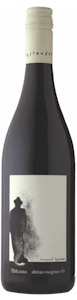
wine bottle examples.....


MFA POSTER - not quite done yet


anything else? is the MFA legible to you guys? i tried playing with it a bit and doing different colors, for some reason when i opened up the file on the computers at school it threw out all the layers i had created so any editing is a pain in the ass because of the excessive amounts of layers and clipping masks which are now all placed onto ONE layer. anyone got any other comments / criticisms? maybe i should put a tornado up in the sky? haha

Friday, October 17, 2008

sarah palin on religion.....

ignore the cheesy background music.....

now obviously this video has been edited alot and is a bit exagerated. but just to explain further for those of you unfamiliar with the beliefs and behavior of "pentacostal" church-goers just watch this next video clip of a church service:

now watch this dubbed version.........

much better. hahahahahahahahaha!!!

Thursday, October 16, 2008

zeitgeist - addendum

http://video.google.com/videoplay?docid=7065205277695921912

this is a good documentary about economic slavery, and its free to watch, i thought i'd share. i highly recommend watching this movie if you have the time to sit down and watch it.

Tuesday, October 14, 2008

how about this??????

can i get some feedback?


so i've been experimenting with texture shots i had taken, and playing around with live trace settings and kinda like this look. but im unsure of which version to go with. what do you guys think: red or blue? gray texture or just white? does the gray texture drown out the text too much? or is it still legible? maybe once i print it out i'll be able to tell for sure. keep in mind i still havent focused on information hierarchy and all that stuff. right now im mainly concerned with the over-all layout of the background.

Sunday, October 5, 2008

for all you smokers in class


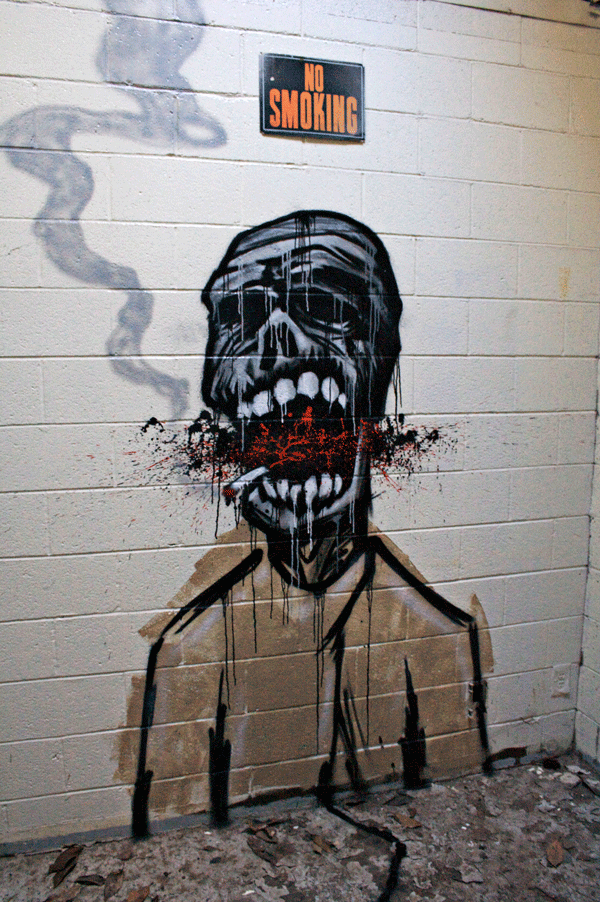
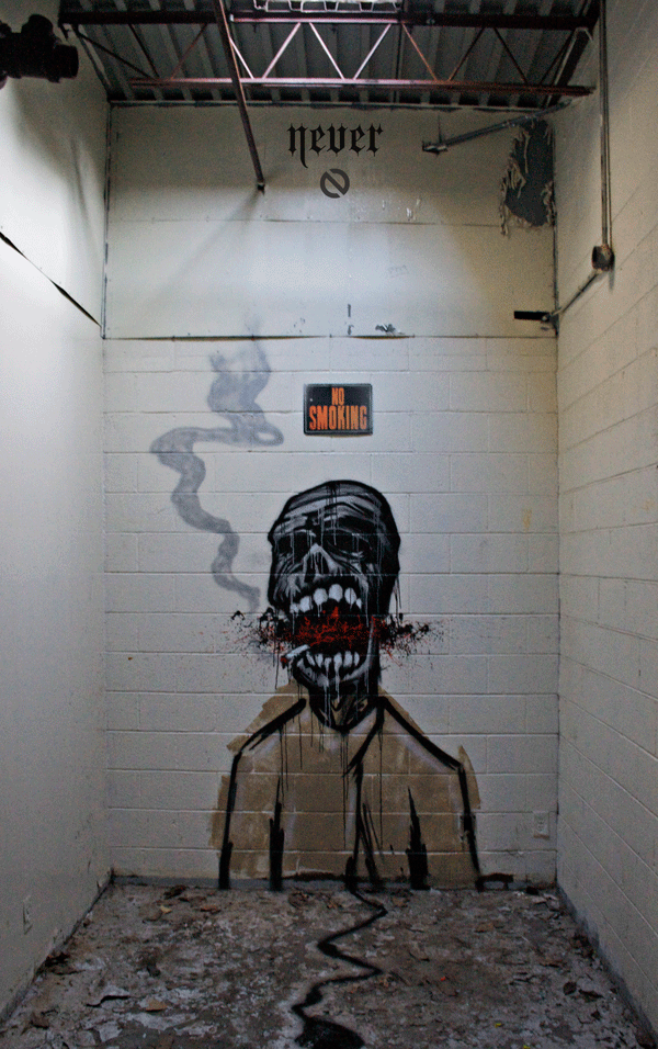
i really needed to paint something to keep my sanity levels normal so i took an hour and a half out of my day sunday and layed up a quick character using the sketch i did for my illustration i am currently working on in Paige's class. i originally intended to just paint a zombie for halloween, but then i saw the "no smoking" sign in that particular room and decided to improvise my concept a bit.........


also, friday night i got an invite to this artshow. basically the whole show was to promote these lofts opening up off memorial drive in reynoldstown. i felt quite out of place because of alot of the boujiness of the people around me at this particular show, but when presented with free drinks i can get around that. i thought this show was interesting because they basically used the entire 4 story building, including the pool deck, and the rooftop to throw this artshow. all of the individual lofts that were currently empty were turned into individual galleries for individual artists to display their work. i have never seen art used to promote luxury lofts in this particular way, thought it was kind of an interesting idea. figured i'd share.....