
Tuesday, October 14, 2008


can i get some feedback?


so i've been experimenting with texture shots i had taken, and playing around with live trace settings and kinda like this look. but im unsure of which version to go with. what do you guys think: red or blue? gray texture or just white? does the gray texture drown out the text too much? or is it still legible? maybe once i print it out i'll be able to tell for sure. keep in mind i still havent focused on information hierarchy and all that stuff. right now im mainly concerned with the over-all layout of the background.
Sunday, October 5, 2008
for all you smokers in class
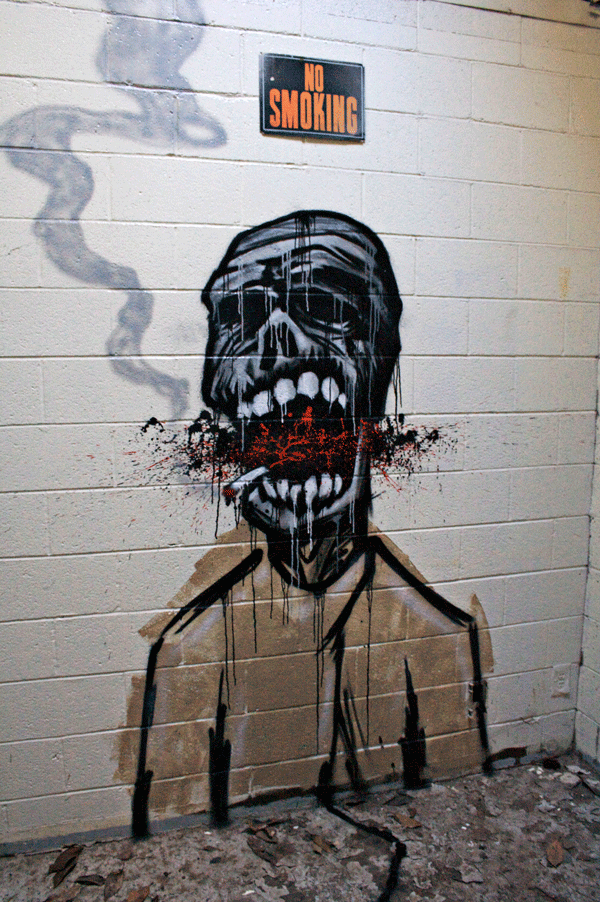
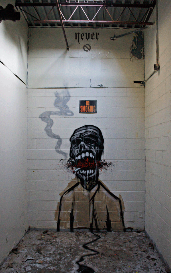
i really needed to paint something to keep my sanity levels normal so i took an hour and a half out of my day sunday and layed up a quick character using the sketch i did for my illustration i am currently working on in Paige's class. i originally intended to just paint a zombie for halloween, but then i saw the "no smoking" sign in that particular room and decided to improvise my concept a bit.........

also, friday night i got an invite to this artshow. basically the whole show was to promote these lofts opening up off memorial drive in reynoldstown. i felt quite out of place because of alot of the boujiness of the people around me at this particular show, but when presented with free drinks i can get around that. i thought this show was interesting because they basically used the entire 4 story building, including the pool deck, and the rooftop to throw this artshow. all of the individual lofts that were currently empty were turned into individual galleries for individual artists to display their work. i have never seen art used to promote luxury lofts in this particular way, thought it was kind of an interesting idea. figured i'd share.....
blog assignment 5: design trends

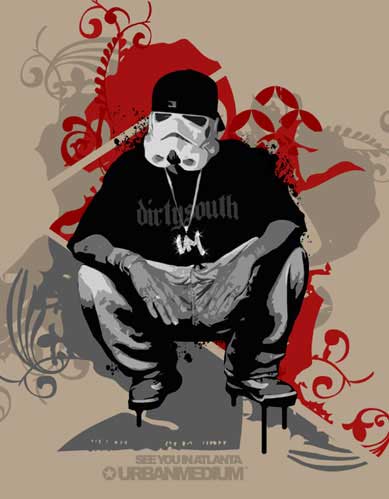
layered collage of vector imagery has been a pretty popular and often successful means of design i've noticed recently.....
this is another example of layering vector images. this is some work by a friend of mine who goes by the alias "urban medium"
another piece by my friend "urban medium". i've felt recently its been quite popular to use the "color halftone" function in photoshop.

the last black and white design (i dont get how it works when i upload photos as far as order goes). this particular design is by my friend Dosa Kim. he does alot of work with a kind of sloppy sharpie marker feel to it. as well as alog of the layering of vector imagery. he is a relatively well-known designer here in town and his work to me definately reflects current trends in graphic design.....
Saturday, October 4, 2008
blog assignment : inspirational work
BANKSY : definatley my favorite artist in regards to concept, subject matter, and placement. this guy has a message, and i HIGHLY recomend his work to anyone who asks.....


DAIM : a german graffiti artists / designer who has an untouchable 3 dimensional style to his work, and his use of color is quite impressive as well
BOND : another European graffiti artist whose work i particularly am impressed with. this guy uses texture well in his work


DAIM : a german graffiti artists / designer who has an untouchable 3 dimensional style to his work, and his use of color is quite impressive as well
BOND : another European graffiti artist whose work i particularly am impressed with. this guy uses texture well in his work
Sunday, September 28, 2008
block of type


Athens, GA. an eclectic community just 70 miles northeast of Atlanta. This bulging urban landscape consists of about 4 square blocks which contain about 34455694667785949857494856749894576849 bars which primarily cater to 18 year olds. i personally like alot of the somewhat old architecture of downtown athens, and noticed that gothic and script fonts were popular in the area. i was stuck up here due to the gas ordeal this past week, so i figured it was the perfect opportunity for me to walk around like a tourist and take retarded pictures.
Tuesday, September 23, 2008
proper use of the poo typeface.........

jason hit the nail right on the head with how to use this typeface. there are PLENTY of great uses for it. unfortunately i did not do any numbers otherwise i would make a "john mccain '08" banner........
Subscribe to:
Posts (Atom)